Via Mixed-Use Development
Translating industrial textures and rich history into an authentic Crossroads development
Balanced by raw, rough facades and modern, polished inserts, Via celebrates its eclectic neighborhood in Kansas City’s Freighthouse District. With its name being pulled from the area’s history of the railroads, Via will pay homage to this site and draw inspiration from train tracks and the beautiful patterns those elements relate when observed in an abstract way.
Location: Kansas City, MO
Size: 181,000 GSF
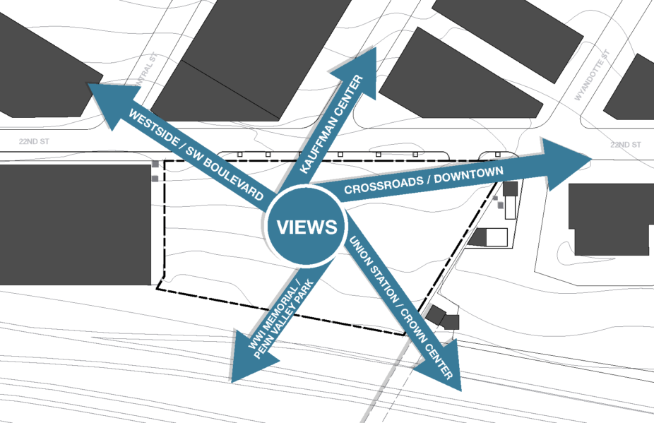
While studying the site, the design team identified the numerous pedestrian connections that surround the area. A large pedestrian bridge provides a convenient thoroughfare to Union Station and unique views of the city and adjacent railways. Neighboring buildings welcome the flood of pedestrians by offering covered “nooks” for them to gather. Via will continue to contribute to this street-level activity and neighborhood vibrancy with an approachable, human-scale lower level and outdoor amenities.

“This project deftly combines the look and feel of the historically rich neighborhood through an industrial yet modern design with stunning views of KC’s iconic Union Station and the Liberty Memorial. The project will be a special addition that celebrates Kansas City.”
— John McGurk, Vice President of Development, Milhaus
Materials will also play a critical role in ensuring that Via plugs into its context. The neighborhood presents an interesting dichotomy between raw facades and polished interiors. Bringing these opposites together is a modern interpretation of the site’s railway history; elevated industrial elements will be incorporated in a way that still provides warmth and refinement.
As the first piece in a larger plan to revitalize this area, Via is a catalyst for future development that will connect the area to other surrounding neighborhoods, creating a thriving ecosystem of growth and prosperity.
“We wanted to make sure that we struck a balance between… refined and yet authentic to the Crossroads, which is to have a little bit of grit to it as well — not too shiny, not too glossy, but something that really is as if you might imagine it to be there.”
— Doug Stockman, AIA, Helix Principal