What We Do
The Crosswalks Master Plan
Reestablishing Armour and Troost as a community hub
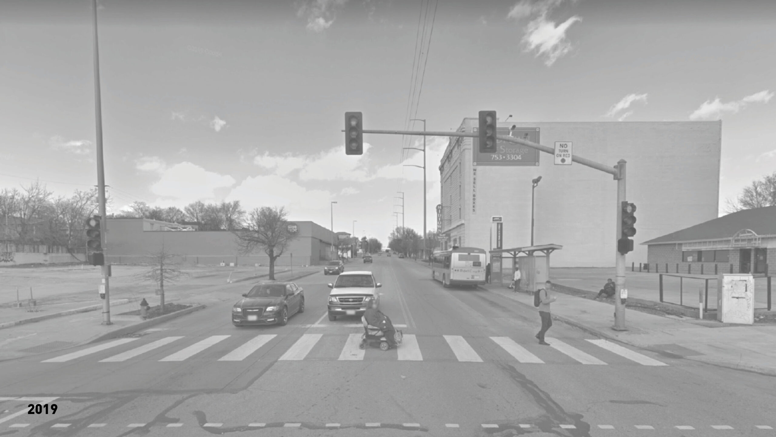
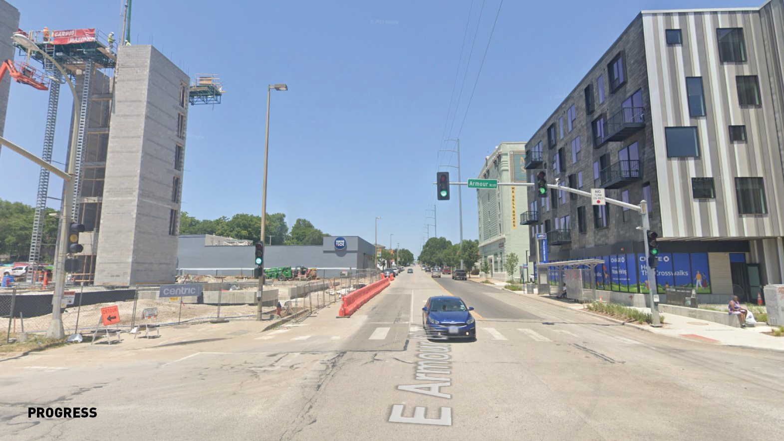
Consider the four corners at the intersection of two city streets: Troost Avenue, which has been seen as Kansas City’s racial dividing line, and Armour Boulevard, a leafy jewel of the city’s parks and boulevards system. Once the crossroads of a thriving commercial corridor and a stately residential thoroughfare, the intersection fell victim to decades of redlining, suburban flight, and neglect. The four corners have become a blank slate for something new and can now act as a catalyst for the area’s revitalization without having to tear down existing buildings or displace anyone.
Location: Kansas City, MO
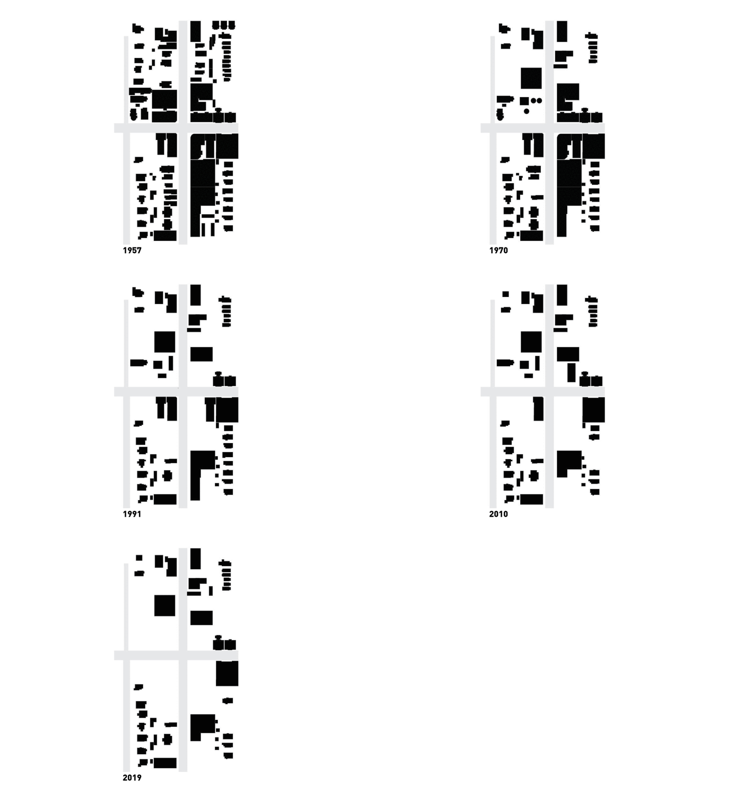
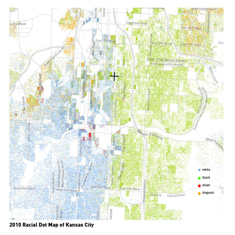
The planning and design process was research-based and data-centered. The team had to be unafraid to confront the area’s uncomfortable social, political, and architectural histories. Each corner of this intersection is part of a unique neighborhood, all with different identities, communities, and even elected representatives. During the master planning and conceptual design, the team delved into the neighborhoods’ defining characteristics and engaged with City representatives and community groups to identify their aspirations for the future.
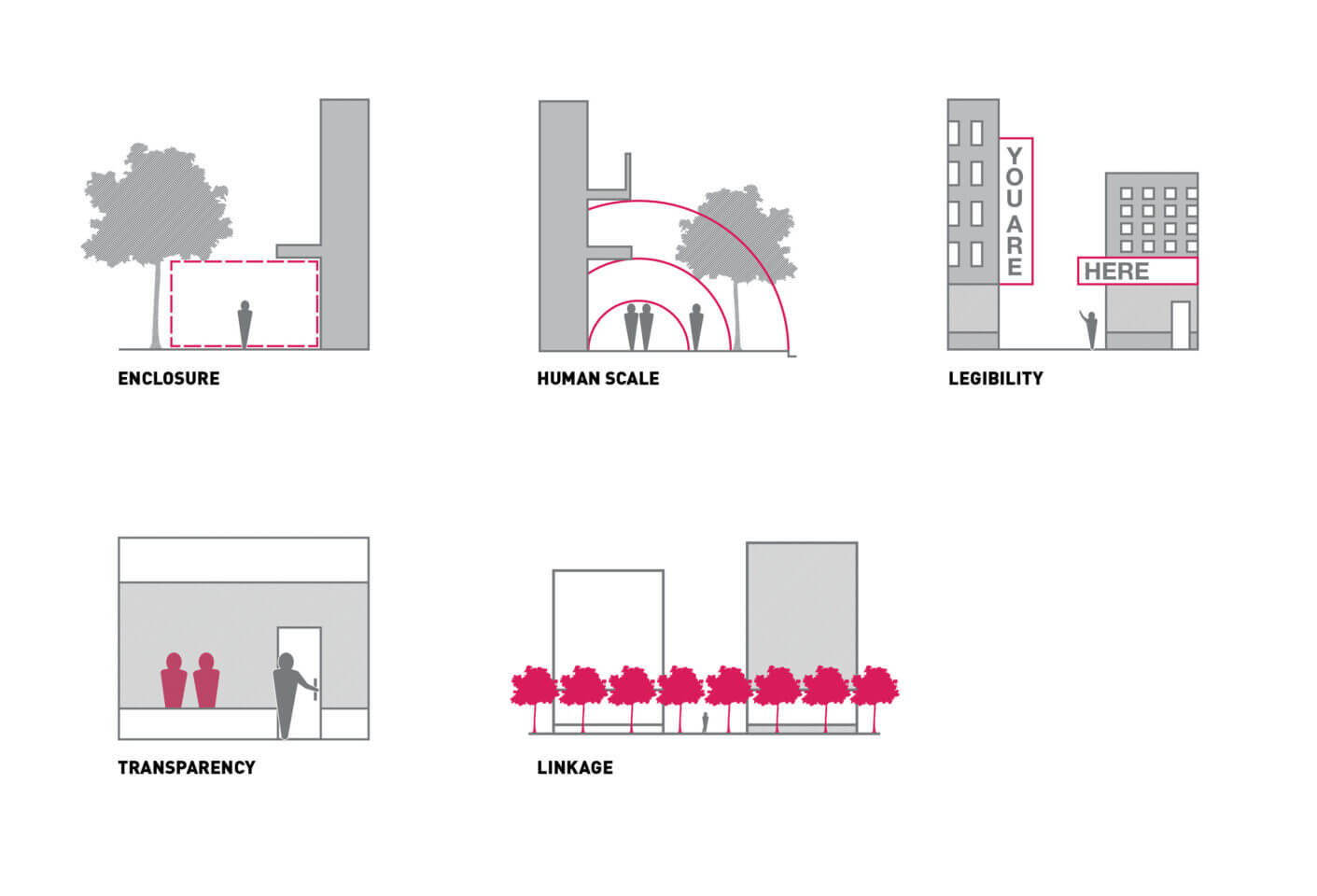
The driving principles for the design of The Crosswalks buildings were informed by an unflinching analysis of the history and context of the area. Guided by Reid Ewing’s tenets of pedestrian and transit-oriented design, the team identified five qualities that would offer the most impact:
Enclosure:
A feeling of defined space and scale created by buildings, trees, walls, etc.
Human Scale:
The recognition and matching of human proportions in the size of articulation of architectural elements.
Legibility:
How easily a person can understand where they are (in a building, neighborhood, city, etc.)
Transparency:
Visual or physical access and interaction between people on the street (or public) and people in adjacent built (or private) spaces.
Linkage:
Unifying physical and visual connections – from building to street, building to building, space to space, or one side of the street to the other.
Focusing on the human element will address the desolate space that is surrounded by defensive architecture. The four corners are to meet in the middle to reestablish a well-defined street wall that once formed a destination. Additionally, the buildings will contain easily accessible retail entries, sidewalk activity, and a distinction of place. Four different designers were assigned a corner and asked to work in isolation of one another to ensure that each building is unique in its façade and interior finishes. The resulting massing and materiality play a key role in respecting the urban context, and a contemporary design showcases a future-oriented outlook.
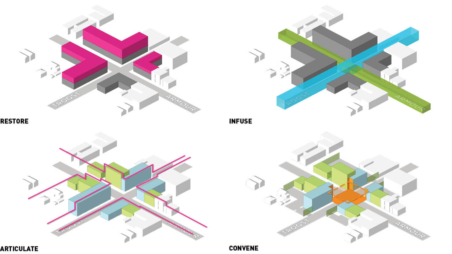
The retail components address priorities outlined by the community. A healthy grocer and national bank will occupy two corners of the site, which will also be conveniently located along free public transportation. As each corner transforms from vacant parking lot to vibrant community, this multifamily residential development will begin to restore a lost urban feel, provide a sense of pedestrian safety and comfort, generate a public good for a long-neglected community, and create a destination within the city.
