Cavalier at the Crosswalks
A fusion of history and neighborhood pride
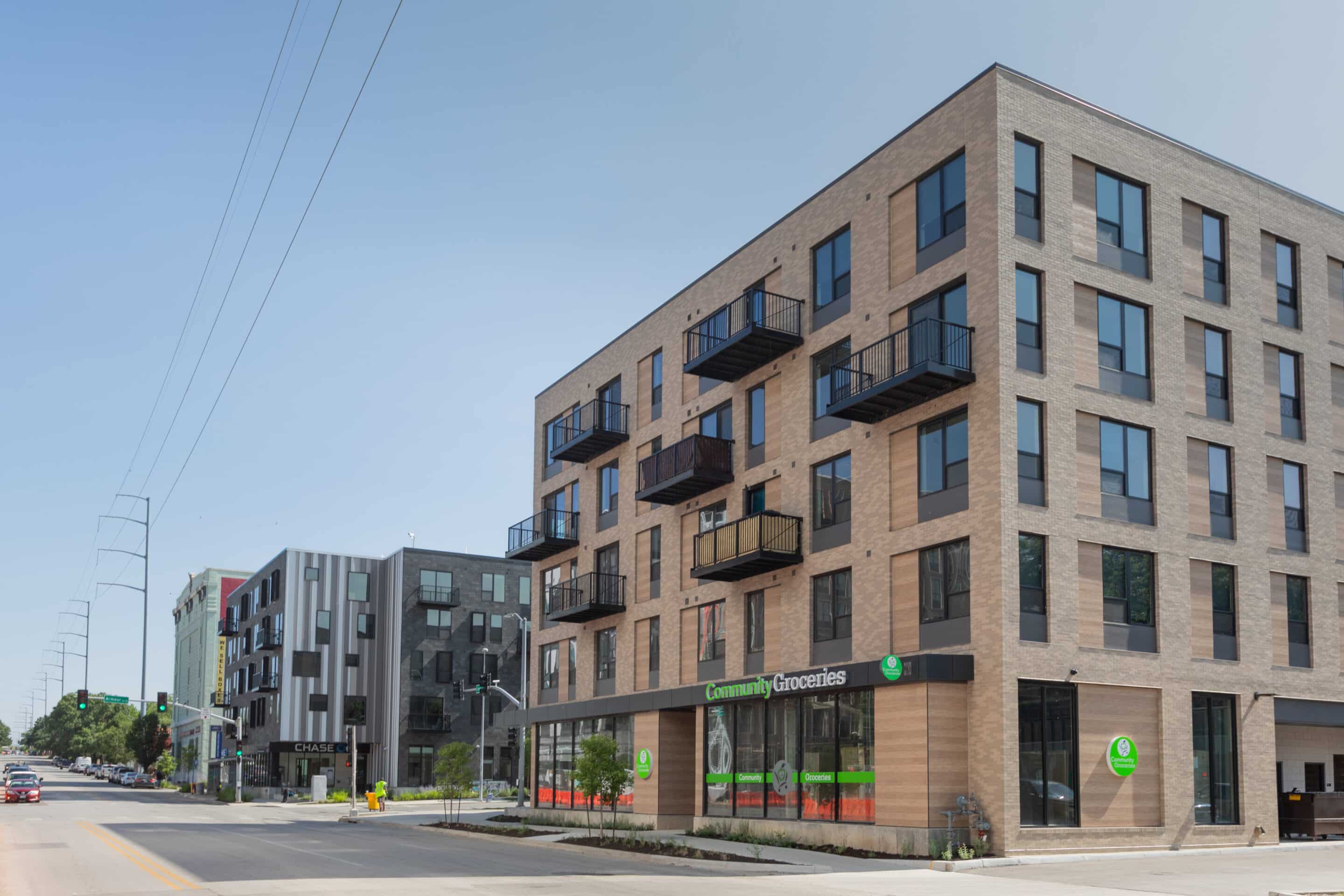
The southeast corner of the intersection at Armour Boulevard and Troost Avenue has a rich and checkered history, comprising of Kansas City’s infamous mob activity in the ‘30s and evolving into a highly active, vibrant hotel and apartments in the ‘50s. Now, the Cavalier, named after those apartments, literally and figuratively sits at the intersection of merging history with future aspirations.
Location: Kansas City, MO
Size: 45,388 SF
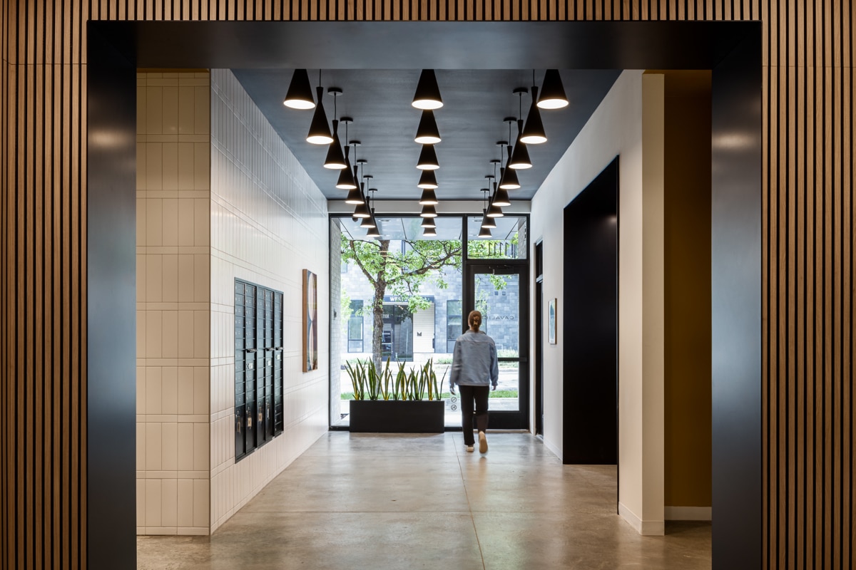
Equal design inspiration came from the historical context of the site as well as the current neighborhood the Cavalier resides in, Squire Park. Valuing pride, preservation, and participation, the neighborhood brings together the diverse group that inhabits it. Principles of Scandinavian design, which emphasize making beauty and function accessible for everyone, resonate with the values of the neighborhood and were infused throughout the design of the building.
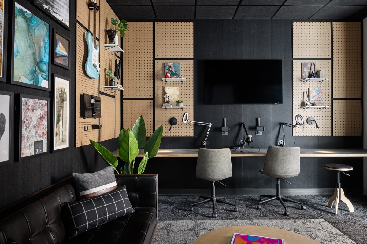
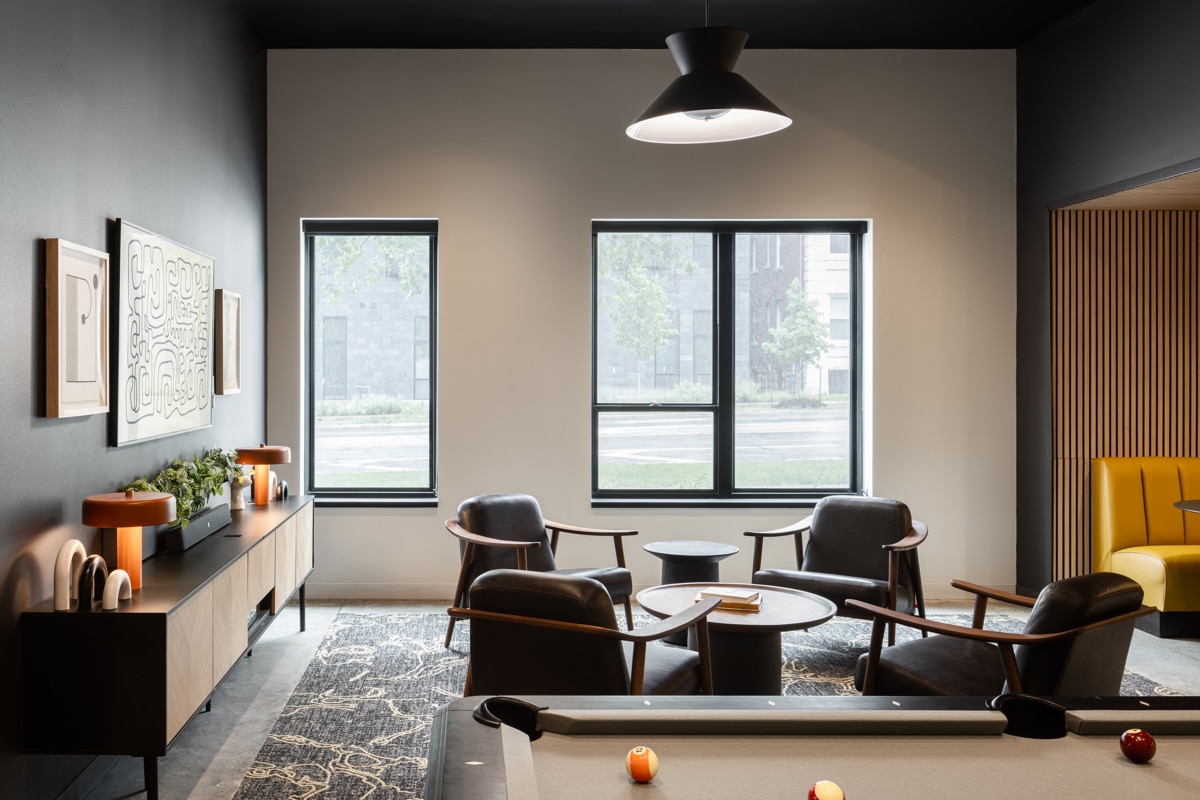
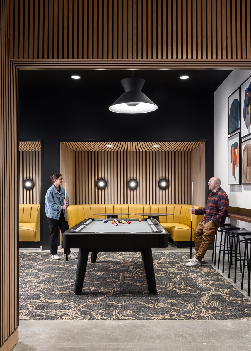
Imbued with Scandinavian design and elements from its past life, the aesthetic of the Cavalier is grounded in clean lines, light materials, and pops of accent colors. The amenities in the building also took a cue from the site’s history, with a distinct connection to the vibe of its ‘50s and ‘60s era heyday. Featuring a music room and lounge, these spaces encourage connection between residents.
Cavalier’s exterior design displays rigor and restraint, leveraging small moves for more powerful impact. A clear and simple material palette guides the overall design, prompting hints of playfulness in inventive ways. Against a backdrop of light brick and complementary tones of wood, a checkerboard layout of balconies creates visual interest and variety. The use of wood and brick brings warmth throughout the entire building in an elegant and understated way.
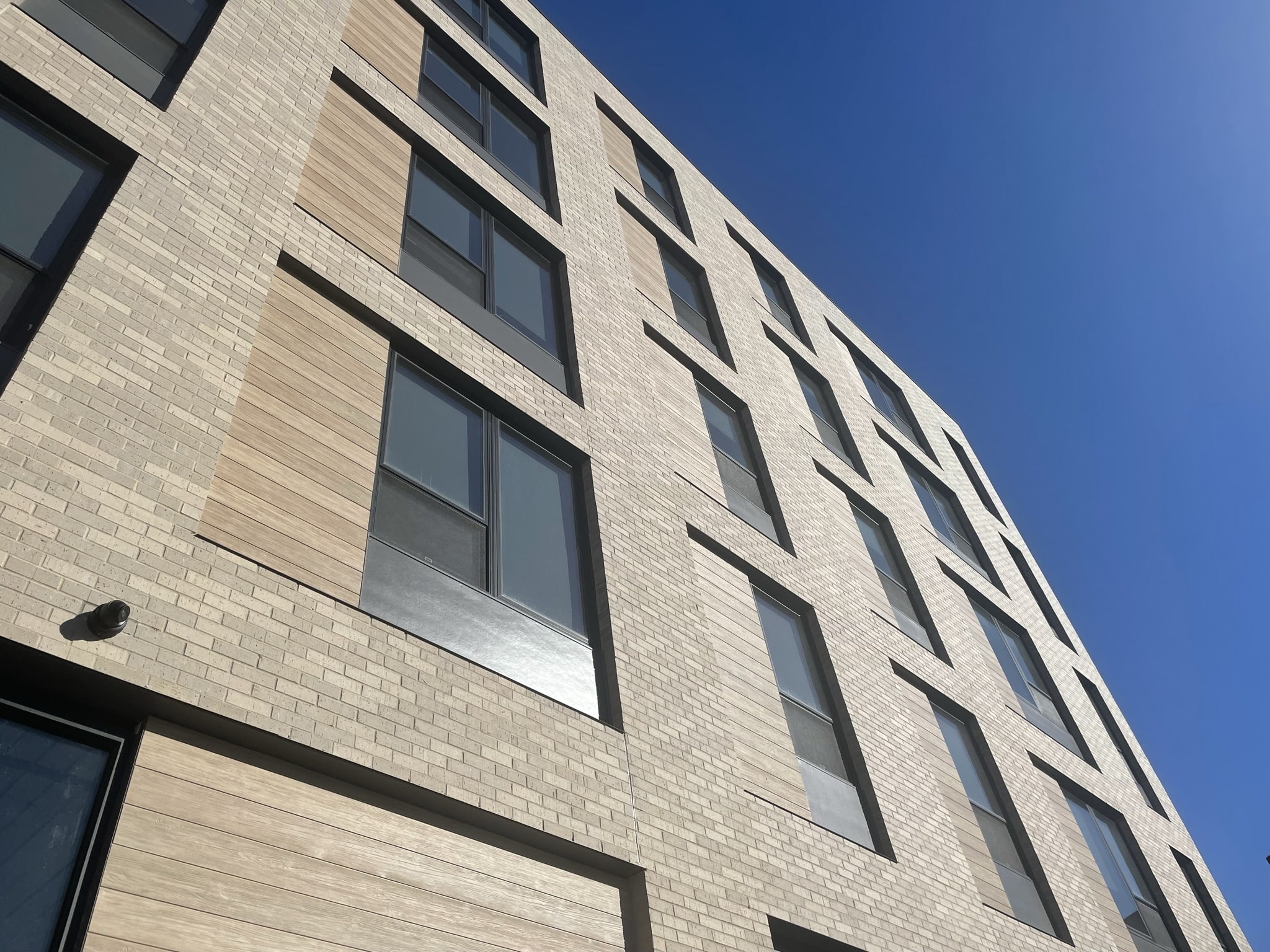
Similar to other corners, the intersection of Armour and Troost is a key moment, distinguished by a contrasting material that calls attention to the place where people are meant to gather. To promote transparency and create a more approachable destination for pedestrians, the first level retail space falls in line with the property boundaries and the residences above are pulled back. Nearly floor-to-ceiling windows offer direct views of the activity happening between the interior and exterior.
A healthy food grocer occupies the ground level, adding an amenity that was highly desired by the overall community. Coupled with the addition of the large, national bank at the Westover on the northeast corner, these two retail spaces tackle the most pressing needs of the neighborhoods.
