History of the Boley Building
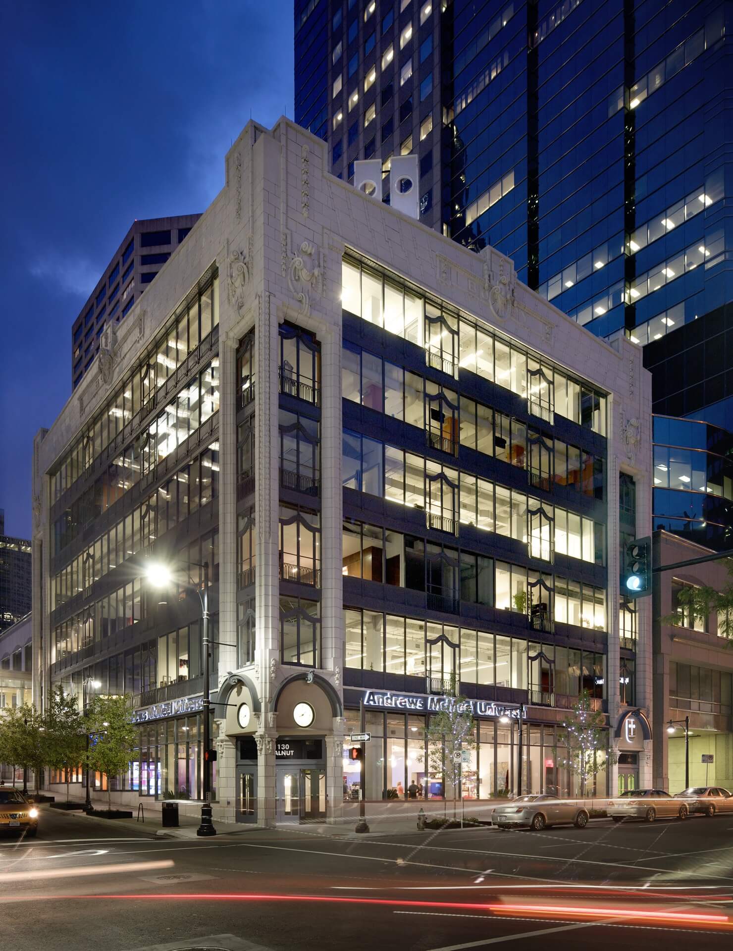
Ten years ago, Andrews McMeel Universal (AMU), an international media and entertainment company, completed the renovation of the historically significant Boley building in the heart of Kansas City’s downtown for its new corporate headquarters. Needing additional space for their 200 plus employees, AMU incorporated the abandoned post-modern food court in the adjacent town center office building. The two opposing architectural environments became the challenge and inspiration for the workplace design, modern with a twist.
In renovating the building, Helix developed a solution reflective of the whimsical and creative nature of AMU’s employees and the significant contributions the company has made to our culture through icons as Doonesbury, Ziggy and Cathy. Designed to stimulate synergy and inspire creativity, the contemporary, light-filled volume with its multi-story grand stair, expansive skylights and ground floor café, resonates with the energy of a company looking to the future while respecting its past.
Conference rooms provide technology infrastructure for meetings and group work. These rooms take advantage of the natural daylight that pours in through the skylight in the former food court.
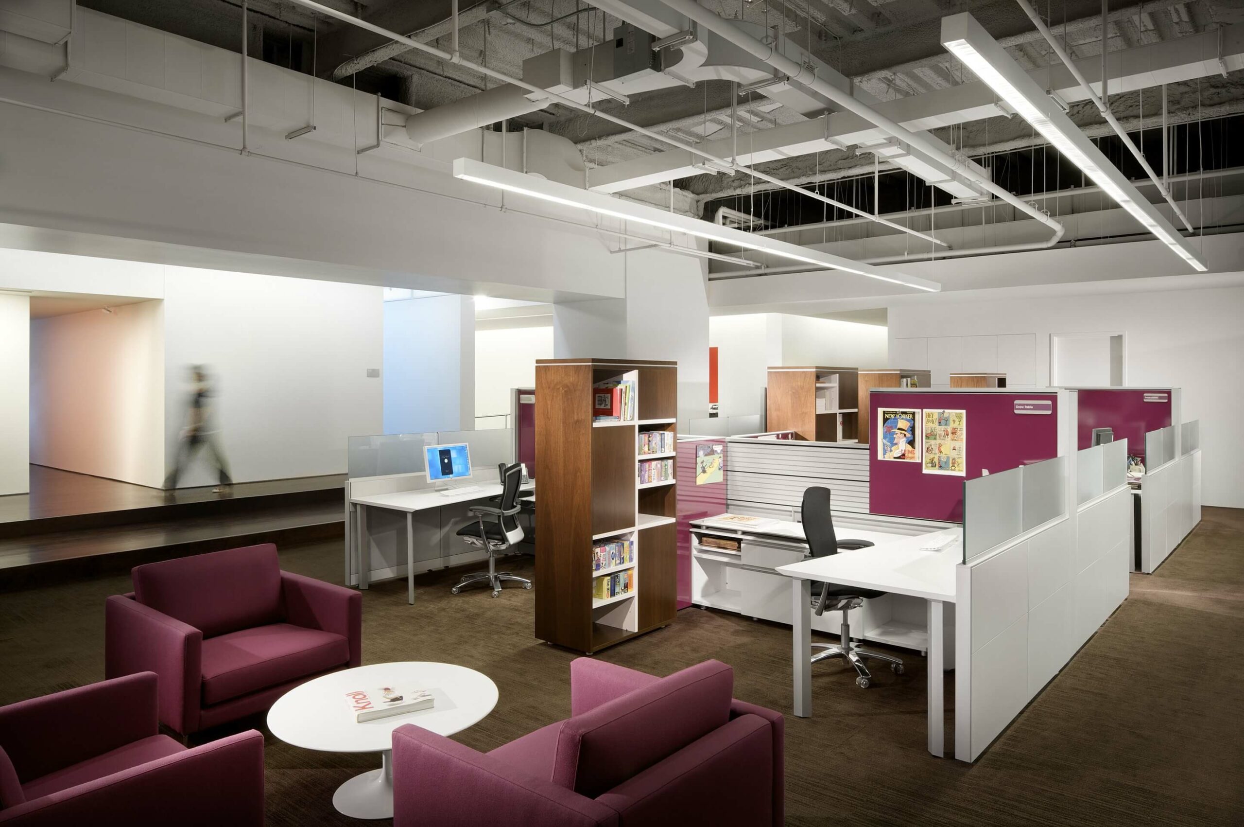
Open workstations allow for easy collaboration. Custom shelving was designed to house AMU’s artwork and products. Marker and magnetic boards were accented with color to encourage self-expression and showcase employee creativity.
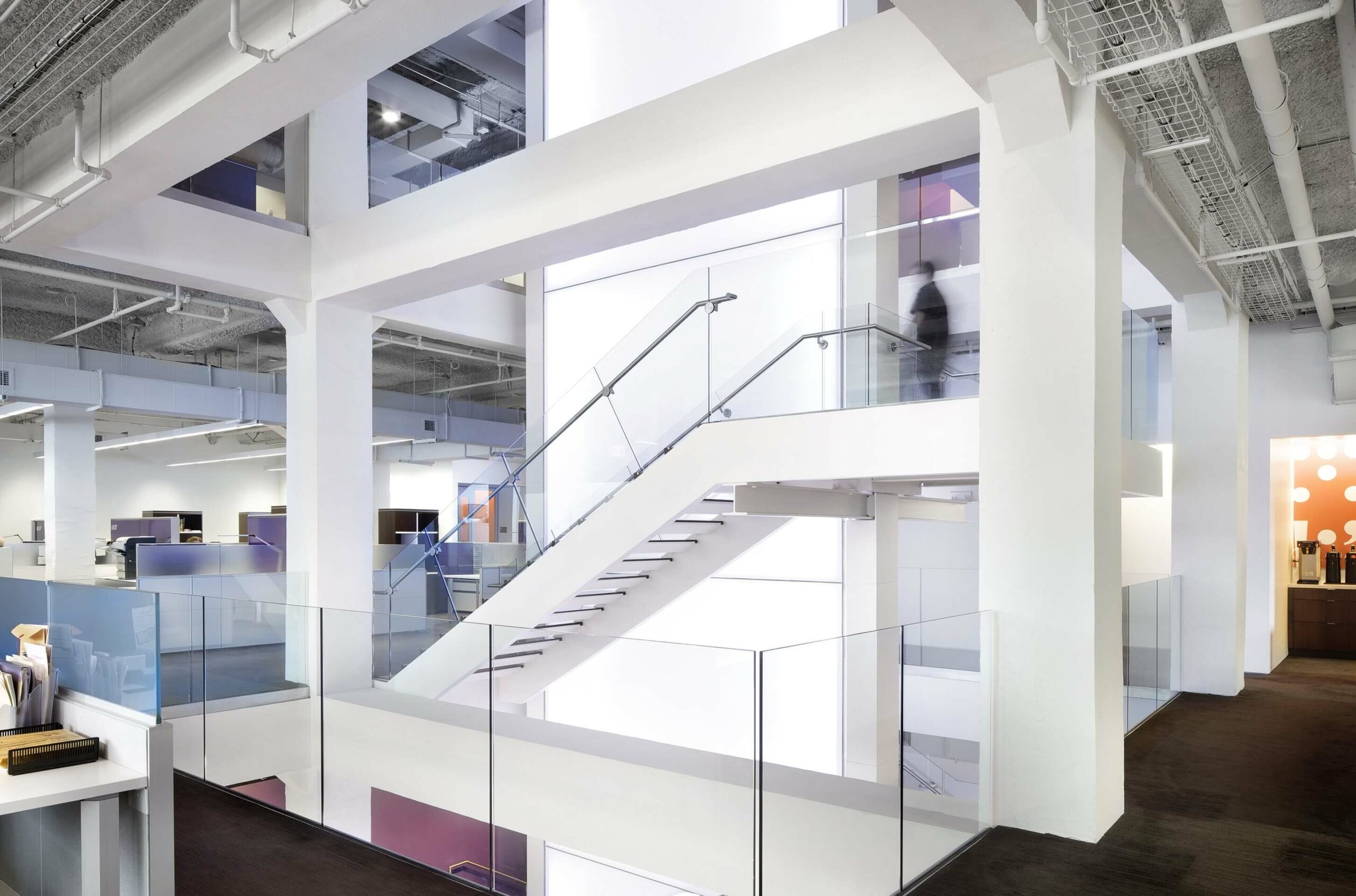
A central stair was introduced to promote synergy and well-being among company employees. The stair is wrapped in stretched fabric to allow daylight in, and it and utilizes LED lighting to represent the energy within.
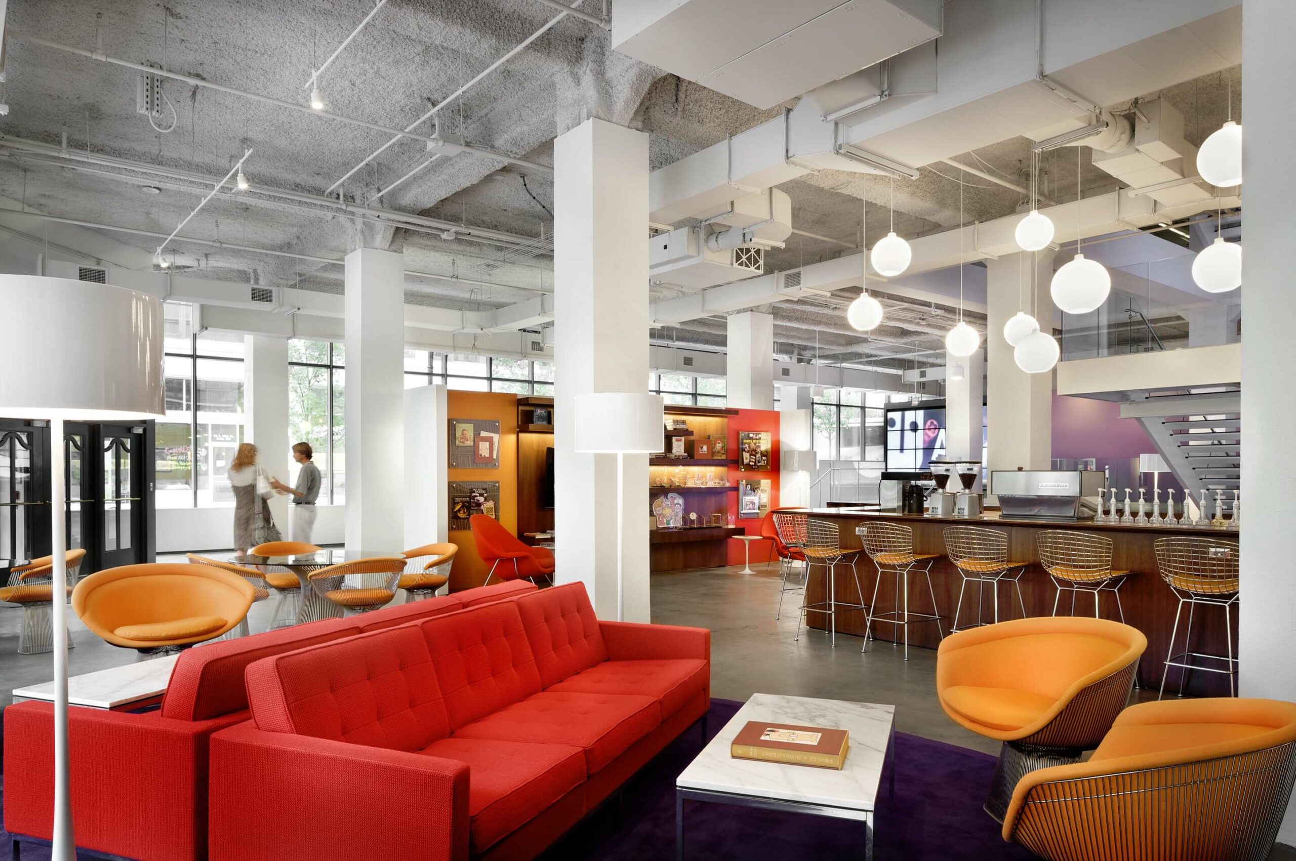
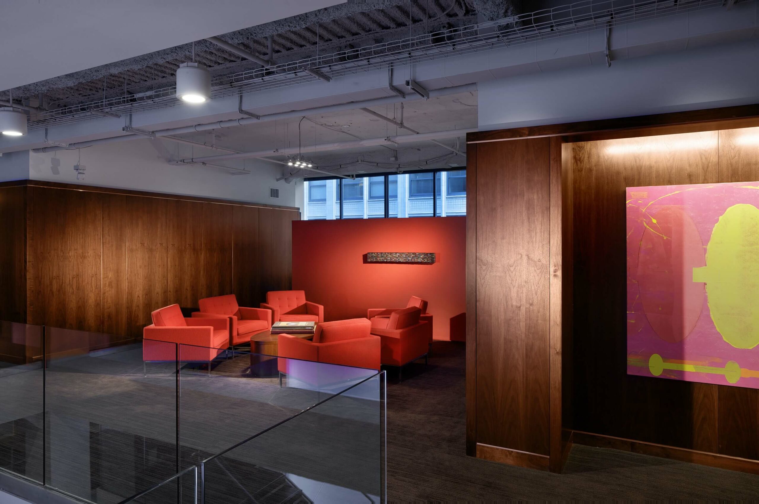
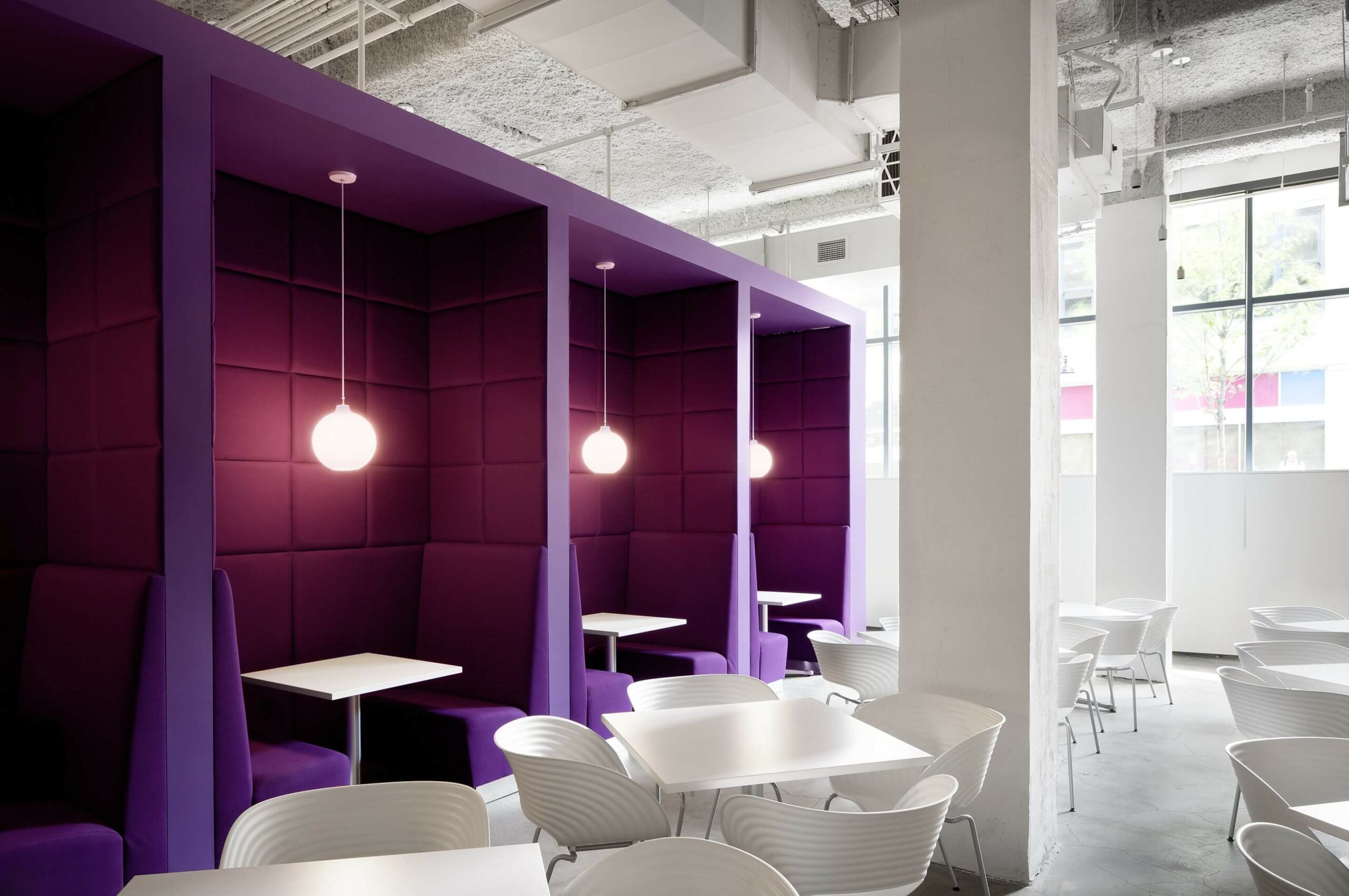
Materials, color and furniture were chosen to tie together classic, elegant design with fun and play. We used bold colors to represent the playfulness of AMU’s work, as well as each business group encompassed within the company. The custom graphic wall-covering in coffee bars features bright colors and symbols of typography to represent the print side of the business. We also used wool fabrics – classic, long-wearing material in the same bold colors – on classic Knoll furniture pieces and wood (walnut) to represent the warmth and strength of organization.
AMU was recently featured in the Kansas City Business Journal for increasing net income by 40% in 2017. We’re delighted to see that ten years later, their headquarters is still serving AMU and their workforce well.